Interface and lifecycle
Components in Nordcraft have a data interface made up of attributes, events and contexts, and follow a specific lifecycle as they are created, updated and removed from the page.
Component interface
The interface of a component defines how it communicates with other parts of your website. There are three communication channels:
- Attributes: Data flow into the component (input)
- Events: Data flow out to parent components (output)
- Contexts: Data flow between parent and any descendant components
- Attributes pass data from parent to child
- Events pass data from child to parent
Defining attributes
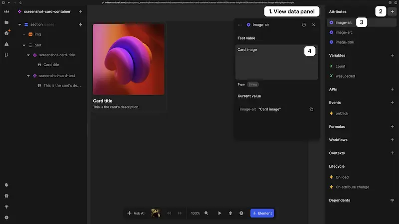
Attributes are the primary way to pass data into a component:
- 1Open the component and view the data panel with no element selected
- 2In the Attributes section, click the + button
- 3Name: Give the attribute a unique name that can consist of lowercase letters, numbers, hyphens (
-) and underscores (_) only - 4Test value: Add a test value to be used in the editor while you work; this test value also determines the attribute type (e.g.
Number,String,Array, etc.) which will be identified by the editor
Attributes allow you to create configurable components that can:
- Alter their behavior based on the data they are passed
- Display different content or styling
- Access data fetched by parent components
- Be reused throughout your project with different configurations
For example, a tooltip component might use attributes to control:
- Which side of the screen the tooltip appears (left, right, top, bottom)
- The delay before showing the tooltip
- What content appears inside the tooltip
- Whether the tooltip has a close button
You can access any defined component attributes inside any formula within the component.
The test value for component attributes is only used while editing your component in the editor. This test value has no impact on how your component will behave when used in other components or pages, or on your live website in production.
Adding events
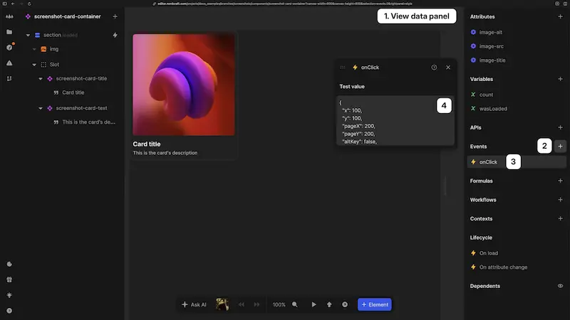
Events allow components to communicate upward to parent elements:
- 1Open the component and view the data panel with no element selected
- 2In the Events section, click the + button
- 3Name: Give the event a descriptive name
- 4Test value: Add example data that defines the event's output structure, allowing you to develop event handling in parent components without actual event triggers.
Events enable child components to send messages and data up to their parent components.
The test data is only used while editing your component. This test data has no impact on how your component will behave when used in other components or pages, or on your live website in production.
Triggering events
Unlike HTML element events that trigger automatically on user interactions, component events must be explicitly triggered from within the component.
Initial steps
- From an element event: Select the triggering element (e.g. a button), go to the events panel and find the appropriate HTML event (e.g.
click) - From a workflow: Create or edit a workflow
Common steps
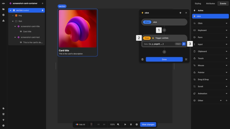
- 1Click the
+button to add a new action - 2In Events, select the
Trigger: eventaction for desired component event to trigger - 3Define the data to send with the event
For a demo of how to add and use component events, check out the following lesson from the Nordcraft Fundamentals video course.
Data flow with contexts
In addition to attributes and events, components can communicate through contexts. Contexts provide an alternative communication channel that allows components to share data and functionality across the component tree without passing through intermediaries.
For detailed information on how to use contexts, see the Contexts page.
Component lifecycle
Components go through several phases during their existence on your website.
Initialization
When a component is first added to a page or another component:
- 1The component is created with its default structure
- 2Attribute values are applied
- 3Variables are initialized with their default values
- 4The
On loadevent is triggered
The initialization phase is the right time to:
- Set up initial state based on attributes
- Fetch initial data from APIs
- Perform one-time setup operations
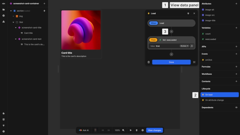
To add initialization logic:
- 1With no element selected, view the data panel
- 2In the Lifecycle section, click on the
On loadevent - 3Add actions to the
On loadevent
Attribute changes
After initialization, components respond to changes in their attributes:
- 1When an attribute value changes, the
On attribute changeevent is triggered - 2The component updates to reflect the new attribute values
This phase is useful for:
- Updating internal state based on new attribute values
- Triggering recalculations or updating data from API calls
- Updating the component's appearance

To add attribute change logic:
- 1With no element selected, view the data panel
- 2In the Lifecycle section, click on the
On attribute changeevent - 3Add actions to the
On attribute changeevent
The On attribute change event is always triggered when any attribute of the component is changed.
Internal state management
Components maintain their own internal state using variables. Component variables are:
- Private to the component instance
- Preserved as long as the component is on the page
- Reset when the component is removed and added again
When a component is removed, all its resources, including event listeners, workflows, and variable values, are automatically cleaned up.