Compositions
Component composition in Nordcraft refers to combining components in various ways. The primary composition patterns in Nordcraft include:
- Nesting components: Adding components inside other components
- Slots: Creating placeholders that can be filled with external content
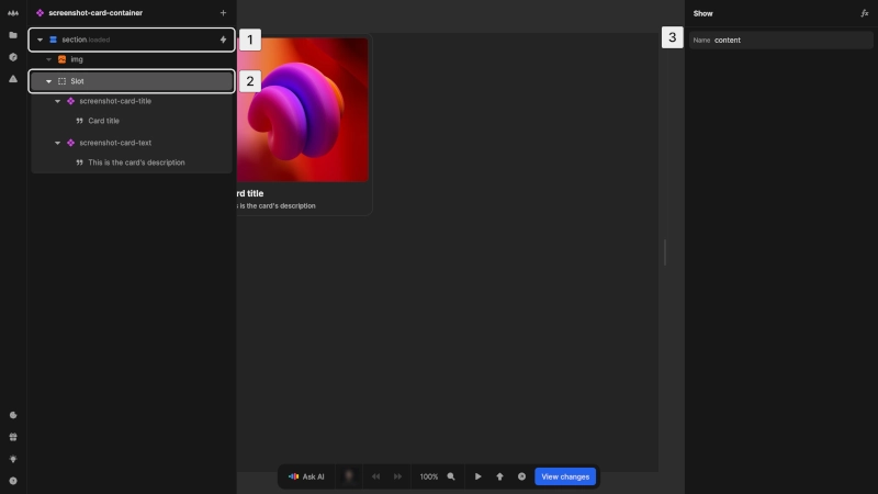
The left card is built with fixed nested components and the right one with slots. Both create the same visual results but with different component architecture.
This example shows two different ways to build a component:
Fixed nested structure:
- Has predefined internal structure with built-in elements
- Structure and content controlled by the card component itself
- You cannot modify the structure directly when using it
Slot-based assembly:
- Provides empty placeholder areas (slots)
- You must manually add elements into slots
- Different component instances can contain different elements
Nesting components
Nesting is where you add components inside other components:
- 1Open a component in the editor
- 2Add another component from the element catalog
- 3Configure the nested component's attributes as needed
Benefits of nesting include:
- Breaking more complex interfaces into manageable pieces
- Reusing functionality at different levels of your project
- Creating clear relationships between UI elements
When nesting components, consider the following:
- Responsibility boundaries: Each component should have a clear, focused responsibility
- Data flow: Parent components pass data down to child components through attributes or contexts. Child components send data up to parents through events or contexts
- Styling: Parent components can style the root element of nested components
As your project grows, you may develop deeper component hierarchies (e.g. components within components within components). While there's no strict limit to nesting depth, it's good practice to maintain clear boundaries of responsibility between components to ensure maintainability.
Slots
Components have access to a special element called a slot, which you can find in the element catalogue. Slots allow you to create placeholders for child content of components. This means that when you use the component in an element tree, you can nest other elements inside that component in situ and render them in a specific area in the component, rather than having to set up a complex system of attributes and configuration inside the component to decide what goes where.
The slot element in Nordcraft follows the web components standard. For more technical details, see the MDN documentation on the slot element.
When exporting a component as a web component, you can use slots like any other web component. You can insert anything, e.g. a React component, by defining the slot attribute on the element.
Adding slots to components
You can add slots to components using the element catalog:
- 1Select where you want to add the slot in your component in the element tree
- 2Add a slot element from the element catalog
- 3Optional: add a name attribute (without a name, the slot is named
default)
Naming
Slots have a naming system. To give a slot a name, select it in the element tree, and name the slot in the right panel in the editor.
- Default slot: displays any child content of that component
- Named slot: receives any child content specifically targeted to it
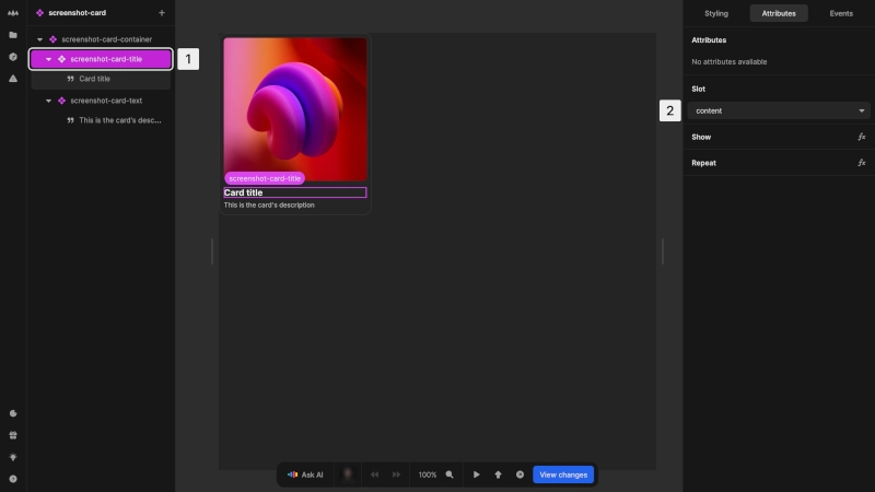
When adding content to a component with slots:
- 1Select the element you want to place in a slot
- 2In the attributes panel, find the Slot section and select which slot should contain this element.
Elements without a specified slot are placed in the default slot
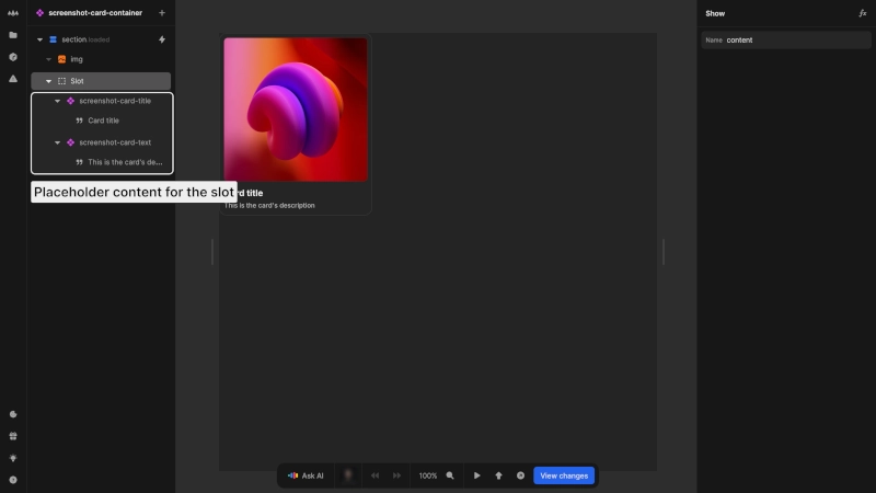
Placeholder content
Slots can contain default content that appears when no content is provided. This default content:
- Is shown when no matching content is provided
- Is replaced when matching content is provided to that slot
Comparing composition approaches
Both nested components and slot-based composition involve nesting components within other components.
When to use fixed nested components:
- You need guaranteed consistency in structure
- The internal elements will always be the same type
- You want to simplify usage by pre-assembling the structure
- The component represents a complete, predefined UI element
When to use slot-based composition:
- You need flexibility in what content appears inside of the parent component
- Different instances of the component need different types of content
- You want to allow completely different elements in each instance
- You need to compose from existing components rather than building everything from scratch
You can also combine both approaches, using nested components for core functionality, and slots for customizable areas.