Element panel
The element panel appears in the right side of the editor when an element is selected, allowing you to configure CSS styling, HTML attributes, and events for the selected element.
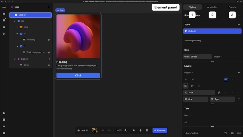
When you select an element in the canvas or element tree, the element panel displays configuration options for that specific element. The panel has three tabs:
- 1Styling: Configure CSS styles for the element and its children
- 2Attributes: Set HTML or component attributes
- 3Events: Create workflows triggered by user interactions on the element
Style panel
The style panel provides a visual interface to edit the CSS of elements and components. All styles generated are in pure CSS syntax, which you can inspect as code using the CSS editor.
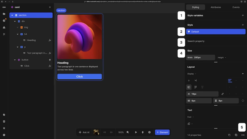
- 1Define style variants (e.g. styles for hover, active and disabled states in addition to the default state)
- 2Search for CSS properties; if they exist on the style panel you will be taken to that area in the style panel
- 3Add or override CSS variables
- 4Set CSS properties for the selected style variant
- 5Use the CSS editor to configure styles using standard CSS code
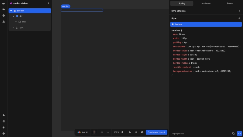
CSS variables
CSS variables provide a way to store and reuse style values throughout your project in the style panel.
- Create and manage CSS variables that can be referenced in your styles
- Override theme variables at the element level for specific use cases or set a local-only variable
- Set up CSS variables in the formula editor to create dynamic, conditional styles
- Define the type, name and set a unit if needed (e.g.
px) - All CSS variables are available for use in CSS properties in the style panel
- CSS variables must be defined in your theme with the correct syntax type to be animated correctly.
Style
The style section manages different visual variants of your element.
- Every element has a
Defaultstyle applied - Add variants with pseudo-classes (e.g.
:hover,:active,:focus-visible) and pseudo-elements (e.g.::before,::after,::selection) - Create variants using CSS classes you defined in the attributes panel
- Set up responsive styles with media queries for different screen sizes
- Combine classes, pseudo-classes and media queries for more complex style variants
- When styling a component, you can select and style a component's class from the outside (see component style overrides)
CSS properties
The CSS properties section provides an interface to set styling properties. All properties defined are generated as pure CSS code in your projects.
- Properties are organized into logical groups like size, layout, text, background, shadow, effects, transform, transition and advanced
- Use the
Advancedsection to set any CSS property not (yet) natively supported in the Nordcraft editor - Use the search field to quickly find specific CSS properties
- View the number of properties set in the current style at the bottom of the style panel
- Copy and paste styles or switch to the CSS editor view using buttons at the bottom of the style panel
CSS Editor
- The CSS editor provides a code view to inspect and edit styles directly using CSS syntax
- All styles you define using the style panel are displayed, including style variants
- Changes made here are automatically applied to the visual style panel view
Attributes panel
The attributes panel allows you to configure the element HTML tag, attributes, classes and special behaviors like conditional display (show/hide) and the repeat formula for the selected element.
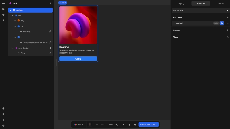
Element tag
- Select the HTML tag for your element (available for HTML elements only)
- Changing the tag allows you to modify the element's behavior while preserving its contents and styling
Attributes
- Add attributes to the element by clicking the + button and entering a name
- Define attribute values directly or bind them to variables or formulas
- Some element tags have predefined attributes (e.g.
typefor input elements) - For components, you can only set the attributes that have been specifically defined for that component
Classes
- Add CSS classes to elements by entering a name and pressing enter
- Bind classes to conditions to apply them dynamically via the
fxbutton - Classes added here can be targeted in the style panel as a style variant
- Classes cannot be added directly to components
Special behaviors
- Show: Control element visibility through conditional formulas that evaluate to
true/false - Repeat: Generate multiple instances of an element based on array data, creating dynamic lists or grids
See the show hide formula page and repeat formula page for more details.
Events panel
The events panel enables you to define interactive behaviors that respond to user actions on elements.
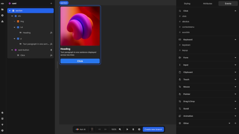
- Events are categorized into groups (click, keyboard, form, input, touch, etc.)
- Events with assigned workflows or actions are highlighted and appear in the Active section at the top of the panel
- Bind workflows, global actions, or trigger component events to any available event
For a complete list of available HTML element events, refer to the MDN documentation event reference.
If you cannot find a standard JavaScript event, you can add it under the Other section.