Themes
Themes in Nordcraft provide a centralized way to manage design tokens across your entire project. By defining colors, spacing, typography and other visual elements in one place, you can ensure styles are consistent across your project. All theme variables are CSS variables, and are available to use in the style panel.
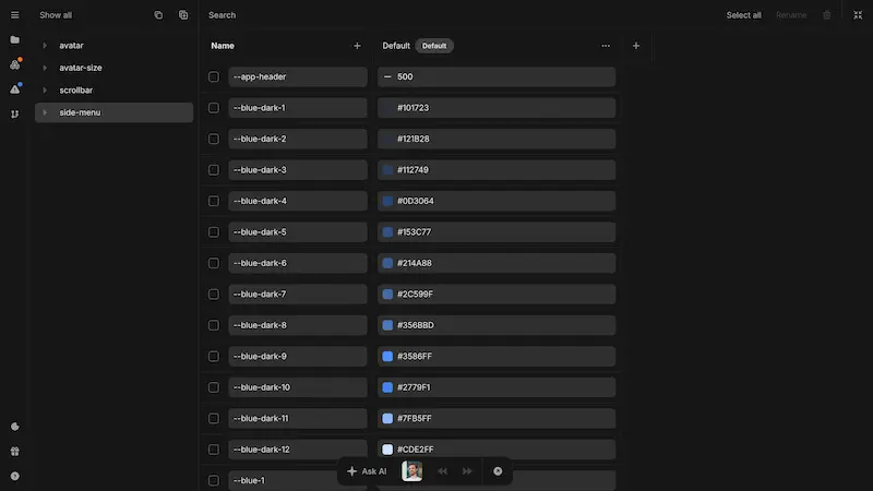
To access the theme editor, open the project sidebar and find the Themes section. You can also open the theme dialog from the bottom bar. Here you can edit your theme with a live view of your changes in context.
Theme variables
Use theme variables to declare CSS variables at a global level for your project. You can then use these variables in your project for styling.
When creating a new theme variable, you define:
| Property | Description | Default |
|---|---|---|
| Name | A unique identifier for the variable. Use kebab-case (e.g., primary-color, button-height). Splitting words with a double hyphen (e.g., button--height) will create a category for the variable in the theme editor to help with variable organization. | N/A |
| Syntax type | The type of value the variable holds (e.g., color, length-percentage, font-family, number, etc.). See the sections below for details on each syntax type or view the underlying syntax property definitions on MDN. | N/A |
| Initial value | The initial value assigned to the variable if no theme value override is applied. This value will also be used if you decide to reset the variable to its default state using the CSS initial keyword. | N/A |
| Description | A brief explanation of the variable's purpose. This is optional and only in the editor for reference. | N/A |
| Inherits | Specifies if the variable should inherit value. Unchecking this option will cause the initial value to always be used or any override value set at the element level. | true |
When using a CSS variable in transition or animations, unchecking Inherits can have a positive effect on performance as the browser can simplify the number of style checks. This effectively makes it as performant as setting CSS variables on the style attribute of HTML elements.
Picking the correct syntax type for theme variables is important as it determines how the variable can be used in your project. Below are the available syntax types and their use cases.
Syntax: Any
The Any(*) syntax type allows you to create theme variables that can hold any CSS value. This is useful for properties that may require different types of values depending on the context or complex CSS values that are not yet supported as specific syntax types.
Note that when using Any(*) variables, the variable will show up in all style property dropdown menus in the style panel, which could be confusing if the variable is not compatible with the selected property.
Using Any(*) will require you to manually input the variable name in the style panel instead of being able to choose from a list of variable names in a dropdown list. This is because the variable is not able to provide type-specific input controls (e.g., color picker, spacing units).
Syntax: Angle
Angle variables are useful for defining rotation values in transformations or gradient angles. This helps maintain consistency in visual effects that involve angular measurements.
Syntax: Color
Color variables can be used for backgrounds, gradients, borders, shadows, text colors, and more throughout your project. Editing a color variable will provide a color picker.
Nordcraft does not enforce any color naming conventions, but deciding on a color scheme helps establish a consistent visual identity. Consider creating variables for:
Primary colors (e.g., primary, secondary, accent)
Neutral colors (e.g., background, surface, text-primary, text-secondary)
Status colors (e.g., success, error, warning, info)
Shades and tints (e.g., gray-100, gray-200, gray-300)
Syntax: Length-percentage
Using variables for layout and spacing properties such as gap, margins and padding helps you create consistently-presented page and component layouts across your project. You can use this syntax type to define font-size variables for consistent typography scaling, or for defining sizes, paddings, margins, and other dimensional properties.
Syntax: Percentage
Percentage variables are a subset of length-percentage variables where only percentage values are allowed. These are useful for defining relative sizes, such as widths or heights based on parent elements.
Syntax: Number
Numbers are useful for defining values that require decimal precision, such as opacity levels, scaling factors, or other numeric properties that benefit from fractional values.
Syntax: Time
Time variables are used for defining durations in animations and transitions. By standardizing time values, you can ensure consistent timing across various interactive elements in your projects.
Syntax: Integer
Integers are mostly used for handling z-index throughout your interface, but can also be used for font-weight management. A well-structured z-index system prevents unintended overlapping issues in complex interfaces.
Syntax: Font-family
Select and manage typography for your project:
- Choose and install fonts from available Google fonts
- Change font families based on the active theme
Defined font-family variables are available in the font dropdown menu in the style panel.
Custom fonts
For fonts not available natively in Nordcraft, you can add them in your page configuration. Navigate to the head assets section to set up custom fonts.
Fonts added via page configuration will only be available on the specific pages to which you add them. To use custom fonts across your entire project, add them to each page that requires them.
Multiple themes
For each theme variable you add, you can define different values for that variable across multiple themes. This allows you to create light and dark themes, different color schemes for various contexts, or any type of theme switching you like.
To create and manage multiple themes:
- 1Open the theme editor from the project sidebar
- 2Click the
+button next to your themes row to add a new theme, or duplicate an existing theme using the context menu of an existing theme - 3Define different values for your theme variables in each theme
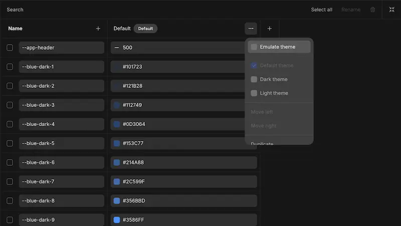
You can preview themes in the editor by using the context menu in the theme editor and selecting Emulate theme. You can also mark a theme as the default theme for your project using the same context menu or set it as the default Dark or Light theme.
Default theme
The default theme is applied to your project unless a different theme is explicitly selected. You can change the default theme at any time in the theme editor by opening the context-menu of a theme (see screenshot above) and checking "Default theme", but you can only have one default theme per project.
All other themes will fall back to the default theme for any variables not explicitly defined in that theme. If a variable is not defined in either the selected theme or the default theme, the variable's initial value will be used instead.
Dark and Light themes
You can optionally mark one theme as the default Dark theme and one as the default Light theme. This allows you to set up automatic theme switching based on user preferences or system settings.
Nordcraft automatically detects whether a user has a preference for dark or light mode based on their operating system or browser preferences, and selects the either the dark or light theme on page load based on those preferences. This happens automatically and requires no extra configuration. If no dark or light theme is set, the default theme will be used.
Setting a theme programmatically
Overriding themes on elements
By default, the Set theme action will reactively (immediately) update the theme when triggered and store the selected theme in a cookie (this ensures SSR compatibility). You can override the default behavior in any page's page configuration under the Themes section to read the theme from local storage, variable or an API for example.
Themes are set at the page level, but you can also set themes on individual elements. To do this, add the special data-nc-theme attribute to an element using the attributes panel, specifying the theme name you wish to use as the value of that attribute. Theme names are case-sensitive and must match exactly.
This allows you to create components or sections of your website that use a different theme than the rest of the page. The element and all its children will use the specified theme.
Dynamic themes
Nordcraft themes are static by default, meaning that theme variables cannot be set using formulas or dynamic values. However, you can create dynamic themes using data from an API, for example, by creating a custom theme-provider component that overrides your theme variables using those dynamic values. This is an advanced use case and requires knowledge of building components.
Using theme variables
All theme variables are available throughout your project:
- Access variables in the style panel of any element
- Select from dropdowns in the relevant property fields (e.g., color picker, spacing inputs)
- Override theme variables in components using static values or dynamic formulas
This approach ensures that changes to the theme automatically propagate throughout your project, maintaining design consistency with minimal effort.
Grouping theme variables
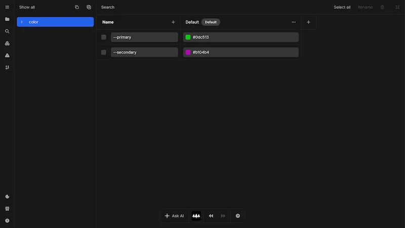
As your project grows, it's often beneficial to group your variables by type such as color, spacing, and so on. This helps you browse long lists of variables more easily inside the theme editor. To group variables, add a double dash to the variable after the group name you wish to create.
For example, --color--primary will create a group named color and a variable name inside that group of primary. You can also create subgroups using additional double dashes. For example, --color--primary--background--default will create a primary group, with a background group inside it, with a variable named default inside that.
When you group variables, you can access them by group name in the left panel of the theme editor.
Using Nordcraft's theme system to define your design tokens in combination with creating reusable components enables you to build out a robust design system for your project. With this approach, there is one source of truth for your design system. When a designer makes an update, the work doesn't need to be done twice.